Overcomplicated Dashboard
My role
UX research and design, UI design, Product Strategy, and Frontend Development
The Team
1 Content Producer/Project Manager
1 Backend Developer
1 Content Student Worker
Platform
Web (HTML, CSS, SCSS, Javascript)
Python
The Problem
Texas A&M University needed a new user experience and user interface for Aggie Account Gateway. The application was a legacy app that hadn't been updated in over 10 years after being on the platform. As the first point of contact between prospective students and parents, this application is used by prospective students to apply to the university and by students, faculty, and staff to manage their passwords, email settings, and directory information.
The Aggie Account Gateway platform and its user interface were not intuitive, not user-friendly, not responsive, nor was it accessible. Due to this, the Help Desk received a lot of account-based phone calls asking for assistance with tasks that should have been easy to complete on the platform..

What was needed
Since there are so many options for interactivity with the page, the previous design was overloaded with information, causing the user to become stuck on the dashboard. It was not easy to determine where you should click to perform an action. In addition, the site still had an interface that wasn't mobile friendly and work well on different screen sizes.
In our redesign, We wanted to create an application that is:
Mobile-friendly
Easy to use and comprehend
Inline with the current brand standards of the university
- Accessibly and usable to all users

Assumption
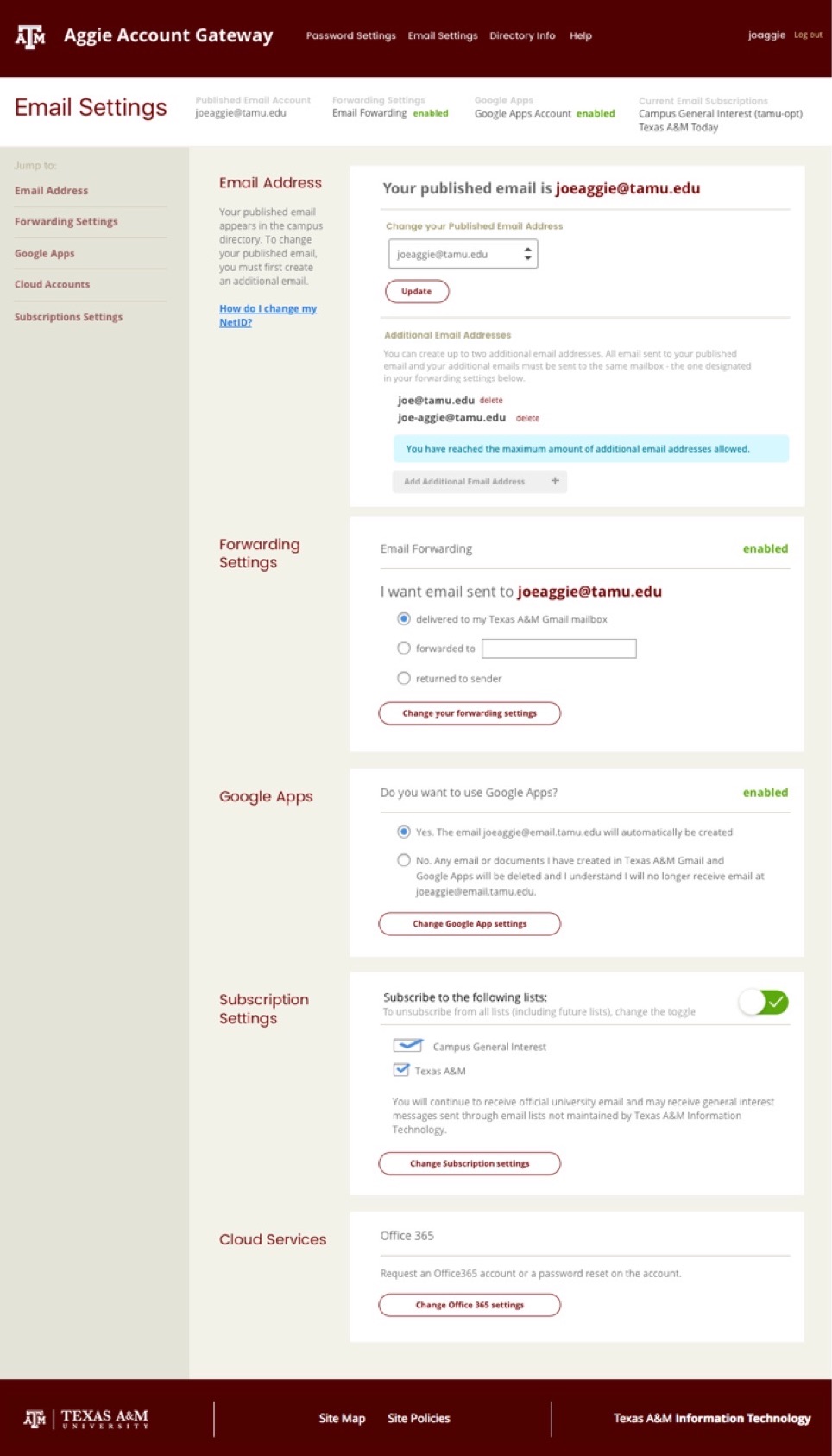
After our user research was completed with out users and Help Desk, I developed a set of wireframes that would add clarity to the user actions by presenting users actions simply and grouping similar tasks.

Full Email Settings Page
Wrong Direction
Although the design was indeed better and easier to follow, the page was still cluttered with information and it wasn't easy to understand which buttons completed the task required to update the account.
After more user research of my new direction, my suspicions about the new direction were found to be true. Although, it was a little easier for the user to understand the information presented. The user still found it difficult to understand which actions were associated with direct updates to their account.
Therefore, I re-thought the design and wireframed a new solution.
The Solution
Since the first design was still cumbersome to maneuver, I rethought how we should present information to our users on the platform. I wanted to present the options for our settings simply and not overwhelm the user but allow them to make logical steps toward account changes. In addition, I wanted to present actions that are the most requested by our Help Desk.

Homepage of the Aggie Account Gateway
First Impressions
Since this is the first impression of Texas A&M University many people have, we wanted to move towards a design that could be a representation of the spirit of the University on a personal level.

Simplified Dashboard
The Dashboard
To accomplish the goal of simplifiying the experience, I wanted to focus our design to allow our visitors to choose what they want to modify before seeing all of their actions. I wanted to begin by presenting the 3 types of settings changes needed first, then the users lands on a page that presents the options under that section. This will allow the user to focus on the area that they want to modify and make it easy to understand what settings they want to change without being overwhelmed with a number of options on a page.

Settings Section page
Simplified Settings Section
This simplified settings page is presented after deciding on the settings type that needs modification. You are able to quickly assess the settings for the section and decide which modifications need to be made in the platform.

Example settings page
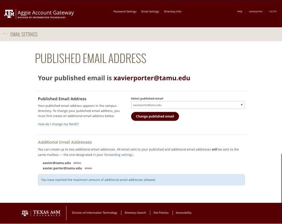
Settings Page
Lastly, the settings page only presents what needs to be changed and the actions to make the change.
UI Details
We made creating a password and username easier by allowing immediate feedback to what is valid and invalid in the password creation process. This has reduced the number of errors in the creation of passwords and allowed users on their mobile devices to perform this action easier.

